35:05



I've just had my hands on with the iPhone 18 Pro, 18 Pro Max, and the iPhone Duo. Yes, the foldable iPhone is finally real, and it's also very clearly the star of the show. In fact, it feels like everything else has taken a backseat just to make sure that nothing steals its spotlight. We're not even getting a base iPhone 18 or a new iPhone Air this year, but it was worth it. Apple absolutely cooked with this Duo. So, let's talk about it, starting with the price, because this thing begins at $2,000. So, $100 more than Samsung's already very expensive equivalent. And if you're curious, it goes all the way up to $3,199
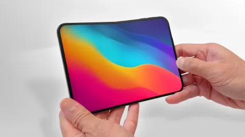
for the 2 TB storage model. You can spend as much on this smartphone as a 2013 Audi A4 5-door 2-liter premium plus car. Don't ask me how I know that. So, the question is, what is Apple doing differently? Because on first glance, there's not a lot. You pull the phone out your pocket, and you are greeted by a 5.4-in outer display. A pretty great one, to be fair. It is just as bright, smooth, and sharp as any Pro iPhone screen. But, it is stockier. And they've actually done something pretty clever here to keep it feeling like the iPhones that you're used to. Because instead of changing the layout of icons on your screen or messing with the spacing, they've actually kept everything the
same, but instead just moved the dock and any quick controls to the side. And then it works pretty much exactly how every other foldable works. You can either have one home screen when it's closed up, or because the inner display is pretty much bang on twice the size, you can open the thing up and have two home screens. When you open an app, as you'd expect, by default, it will just fill the entire screen. But, now you can also lift any app up and throw it off to the side. This will turn into a split screen and give you the option to add something else to the other side. Dragging things between apps also works as you'd expect. So, you can hold down on a shot from photos and just drop it into your
messages. You can also tap this middle line to join whichever two apps are open. This means that they'll essentially behave as if they're a single app that you can swipe up and move away from and then come back to later with the windows still preserved in their original positions. And then finally, just like other recent foldables, there's a sort of flex mode where you can slightly close up the phone to split it into two. And in some apps, this will unlock secondary controls. I got to say, some part of me was expecting to see a few more completely new original features. You know, this is a landmark moment. It's Apple's first big form factor change ever on the iPhone. But largely, it feels like Apple has very clearly decided that they don't need to
reinvent the wheel. What they need to do is to take the base that Samsung and other companies have spent the last 7 years building on, refine it, and make it an iPhone. So, you can tell they've put a lot into the build and the feel of the thing. The frame is titanium and the hinge is that plus a bunch of carbon fiber. I wouldn't say this hinge feels like anything particularly unique. And also, this is a thicker phone than I was expecting at 5.2 mm cuz when opened up. So, quite a bit thicker than, let's say, Samsung's equivalent. But I do think the phone feels uniquely solid because it's not going for thinness.
Plus, they still got that IP68 rating. And even though there's not much new in the way of actual features, there are so many ways in which Apple has improved things that are already out there. Like, for example, this inner display. They've added a nano texture coating, and I could not believe how much this cuts down on reflections. This is immediately, by far, the least reflective display that I've ever seen on a smartphone, period. And there's a second perk. The crease. It exists, but barely. You just know that if it was a major crease, they'd find a way to name it and turn it into a feature, like Dynamic Valley. Or Contour Pro. But the reason that they haven't is because this is about as invisible as creases get. You can feel it a more
than you can see it as you move your finger between the two halves, but still I've never seen this done better. I thought the speakers would suck, but actually there are three of them here and early impressions are very immersive. I thought the battery would be sub par, but they're promising between 31 and 44 hours depending on which screen you're using, which I mean for perspective the very decent iPhone 17 Pro from last year was 33 hours. So these are extremely healthy numbers. Usually foldables will try to get by with the minimum possible cooling because space is so tight. But no, the Duo still apparently has a vapor chamber and Apple's still claiming that this phone will have much better thermal performance than last year's Pro
phones, which if you remember was all they talked about last year. They still managed to fit magsafe inside of here. The only other foldable with magnetic charging is Google's. And then I guess to top it all off it's going to support the Apple Pencil, which they're bringing later in the year. This is the benefit of Apple taking the easy road with this phone. By waiting for so long they were able to just sit back and let other companies do the innovating and make the mistakes for them, which means while there are still some strange caveats, which I'm getting to, Apple's been able to spend the vast majority of their energy just making everything feel surprisingly polished for a first gen product. And that's not just hardware, the software
too. Like they have absolutely cleaned up when it comes to animations. Every single thing I tried, the new way that the home screens animate, the depth effects they've added around the screens being opened and closed, even the way that the keyboard splits. It's all just very visually satisfying. They've integrated their standby mode into the normal use of the phone. So let's say you want to get some work done and you're trying to focus, you hit the power button, you prop it up on your desk, and the phone will just revert to this much less distracting UI. I was really happy to see that all the apps seem to be very well formatted for both the inner and the outer screens slightly unusual sizes. So when you're on the
inner screen you tend to get the bigger iPad style version of apps with extra menus. And then when you shut it, you get the compact smartphone equivalents. And the way that it lets you fluidly dive between using an app in landscape and then portrait and then on the cover screen and then back to the main screen and even opening up other things alongside it. I've never seen a company nail the handoffs between each of these states the way that Apple has here. Although we will need to venture out of Apple's pre-vetted app examples to see if everything else feels as optimized. Also, just like when you're using an iPad, you can spin it around like a Beyblade and it keeps up in any
of the orientations 360°. But it's not all sunshine and roses. There are quite a few things that you're giving up here and a lot of them are not immediately obvious. So for example, while the inner screen is dramatically matte and anti-reflective, the front screen looks like it lacks any kind of anti-reflective treatment, so is very prone to glare. Plus a lot of people that I talked to were absolutely gushing about this passport-like form factor. And I like it, but just be aware that because the thing's so wide, it's not completely usable in one hand. A lot of very normal day-to-day things like reaching widgets and pulling down Siri definitely felt like an uncomfortable stretch. It's a little odd that the volume buttons are at the top
of the phone. And me personally, I'd rather they just give up with this camera control thing that, let's be honest, people are only using accidentally anyways and put volume back on the side. Oh, and speaking of cameras, the selfie cameras are not what they seem. Like the one on the very front, while it's good that it retains the ability to take both vertical and horizontal pictures, it only shoots 12 megapixel shots instead of the 18 that you get on Apple's bar phones. And if you thought that was bad, the inner camera is diabolical. It's an under-display camera, so you will notice it appearing when needed and disappearing when you're done with it, which sounds like it would be a feature, but I would place this squarely into the weaknesses section because
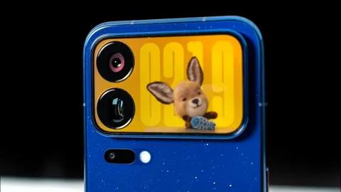
the quality sucks. And it's a bit of a shame to see such an obvious sore thumb in what is otherwise an immensely premium experience. Oh, yeah, and funnily enough, it's not even invisible because the thing has an entirely different texture to the rest of the screen. There is a little bit of redemption in the fact that if you do want a high-quality selfie, you can now flip your phone around and take one on the rear cameras. And Apple's even added to this with a new feature I've never seen before which displays whimsical imagery to help kids smile for their photos. But still, this isn't the easiest way to take a selfie. Also, we should be very clear about something that even though this is by far the most expensive iPhone ever, and it will
almost definitely become the status symbol iPhone, that doesn't make it the best iPhone. Like for example, compared to one of the Pros, there's only two rear cameras here, a main and an ultrawide. You don't get the telephoto that you would on a Pro phone, which I think is a big loss because it's not just about zooming into things. I started using this lens all the time, especially with little boss, not just because the guy's like this big, but it's also just so much more flattering than using the main camera and going up close. The two cameras that you do get, they're not Pro level either. This camera setup is much more equivalent to what you actually got
on the base iPhone 17. So, you should expect not quite as much detail or natural background blur. There's no action button, although to be fair, of all battles I want to fight, that's not one of them. And because they can't build two sets of Face ID for each of the two states, the Duo instead uses Touch ID in the side button. I mean, I never hated Touch ID, and it is definitely easier to use here than when it used to be in the middle on the home button, but it's definitely a step back compared to Face ID, and it's going to mean more friction anytime that you need to authenticate yourself. All things considered though, the Duo impressed me a lot more than I thought it would. I came into this
thinking that it's just going to be yet another foldable that is an iPhone, but it actually does feel like the most complete foldable experience to exist so far. It's just not the new iPhone that I'd recommend most people buy. That would be the Pros. So, let's talk about them because given that Apple already gave these things a big redesign last year, and given that they specifically don't want another attention-grabber to take away from the folding phone's limelight, this year's Pro iPhones are not a showy upgrade. But, what I wanted to find out is, are they still an important one? Well, the 18 Pro and Pro Max look very similar to last year's 17s. You still got the camera plateau, you still got that glass
and aluminum body, but you will need to treat with care. Although, it is all now color-matched instead of the two-tony look of your But, the key thing you'll notice is that the new phones are even heavier. They are the heaviest set of Pros to ever exist. So, what have they done with all that extra heft? Well, they've managed to fit part of Face ID under the display now. So, your Dynamic Island is about 35% narrower. And it is cool to see that they haven't just left it at that. They're now using the extra space to let you juggle three different live activities instead of two, with all the expected Apple pizzazz that comes with that. But, really, I would say that there are three upgrades that are notable steps forward. One is that A20
Pro chip. Because after 3 years of 3-nanometer chips, this is the first time that Apple's moving to a cutting-edge 2-nanometer process. Or, in English, the building blocks of the chip just got smaller. So, you can fit more of them in the same space, and each one sips less power than before. Which basically means that you can expect the phones to last longer, have up to Yes, 40% faster performance, depending on what you're doing, or just run cooler, helped by a vapor chamber that now has a rather impressively three times surface area compared to last year. I will say, I spent longer than I should have playing the latest Monster Hunter on this thing. And I might be biased because this is literally my favorite video game franchise of all
time, but it was very technically impressive. It ran at a flawless 120 frames per second, and I think it looks insane. And this chip is a little more than just gaming, because they've also doubled the AI compute power, which is now apparently finally enough power to improve the dictation quality. But, I have no idea why they needed an A20 Pro for that. I feel like the chip in a singing birthday card could have improved Apple's dictation. And to top it all off, the A20 Pro also comes packaged with the C2 modem, which should mean a little bump to internet speeds and reliability. The second key improvement is battery. With the normal Pro, it's an expected jump, 36 hours compared to 33 last because
this is mostly just relying on efficiency improvements. But, the Pro Max's battery life is 45 hours because it's that paired with a much larger battery cell, too. I mean, clearly Apple's doing some sort of karmic retribution for the decade of all-day battery, maybe. Because, I mean, the 17 Pro Max was already lasting a really long time, and this is at least 6 hours more than that. Definitely a valid reason to consider Pro Max over Pro this time cuz we've never seen a bigger gap between the two. Oh, and it's a double win this time because even with that larger battery, the charging should now be roughly 20% faster. And then three is the cameras. And really, there's one thing that's changed here hardware-wise.
The main camera gets a variable aperture, which means that you can have a wide opening if you want to let maximum light in, but then you can also narrow it right down to minimize the light. I'd actually say that the best part of this update is the software. Because now when you open up the camera app, you get Pro tools. So, you can tweak the aperture. It'll start on an auto setting, but you can manually pick between four different levels. But, also just a ton of other useful things like shutter speed, white balance, and focus. It's the kind of stuff that would have previously required you to move over to a much messier third-party camera app. So, it's awesome that it's baked in now. And the other upside of
this variable aperture is that when you do open it up to its new widest setting, it is wider than it was before, which means more light, and more light gives you more detail, more brightness, more of that pro-looking background blur. However, I feel like I need to say, Apple talked about variable aperture as if it's like the eighth wonder of the world. I don't think most people should care. Because the actual act of being able to narrow your aperture down to reduce all of those good things I talked about is inherently niche. It's a bit like shipping a Wi-Fi router with a toggle to slow down. You might want it on very rare occasions for very specific things, but 95% of people who buy one of
these Pros, I think you'd be better off just setting the aperture manually to its widest setting and never thinking about it again. There's a reason that Samsung dropped this feature on their phones in 2020. And how many people have you heard asking for it back? There are also a handful of additional, actually very handy, software-level improvements. Like how you can now add the cinematic effect to videos after you've taken them. Photographic Styles now gives you the new option to decide whether you want to smooth out your skin, or if you're feeling exceptionally confident, enhance skin texture by default when you take photos. And being able to now double-tap anything in your camera to
make your focus track that subject is extremely overdue, but nonetheless very clutch. The only other upgrade for the Pros is the not-so-fun one. It's the price. Both phones are now up by $100 each. So, the 18 Pro starts at $1199, and then the Pro Max $1299. We've seen this exact trend with Samsung and Google. And just like those companies, here we're getting these price rises without something that feels like an out-of-the-ordinary upgrade. But really, this is very much just our costs are going up, so are yours. And while I imagine that $100 bump isn't even fully covering Apple's extra component costs,
don't you worry, they are making it back via the higher storage options. I've got the site right here. And while previously there was a $200 price gap between the 512 and 1 TB model, you will now pay $400 for that same increment. Oh yeah, and it's not just the new phones. Apple's actually quietly bumped the price of every other phone they're selling, too, by $100. So, you know the iPhone 17 launched at $799? It's now $899. Also, the more expensive the iPhones keep getting, the more that you need to protect them. So, I'm very glad that Torras, our sponsor, have figured out that this doesn't mean your cases need to get bulkier, just smarter.
With their Q3 Air Pro, they've created both an outer airbag which intercepts impact and then an inner one, which disperses whatever's left. There's an anti-slip texture and a super strong magnet, which makes you less likely to drop it in the first place. This built-in O-Stand is something I've been using myself every single day for the last 4 years. It is that clutch. And then, if you want, you can tie the bow with the Origami screen protector, which actually reduces reflections as opposed to most screen protectors, which increase them. So, just search for Torras O-Stand Q3 Air Pro on Amazon or their website and check the description for the discount code.